→ making food both fun and affordable for college students 🍱
→ ui/ux/interaction design, prototyping, user testing, branding 👨🏽💻
→ jan 2020 - sept 2020 🗓
→ figma file 🔗 ← please explore!
→ named the judges' choice winner for LavaLab's Spring 2020 cohort! 🏆
role
I was the sole UX Designer at Nibble, tasked with branding the company and designing the main digital product: Nibble's mobile application. I worked alongside two Developers and one Product Manager.
about Nibble 😋
Nibble began as my team's project for USC LavaLab (a student-run product incubator). We designed and built the product over the Spring semester of my Junior year at USC, and continued it into the summer.

At the end of the semester, every LavaLab team presented their products to a panel of judges and Nibble was chosen as the winner! 🏆

problem
One million tons of food goes into LA’s landfills every year. This issue of end-of-day food waste leads to unsustainable restaurant practices: wasting resources and ingredients. With the addition of high food prices in the LA area, a change is needed in this industry.

solution
My team and I decided to tackle this issue by developing a platform for restaurants and cafes to sell their extra end-of-day food for a discounted price, benefiting the restaurant and the consumer.
We wanted to build excitement around discounted food.

live menu and restaurant page
Being the main connection between the user and app, the live menu had to elicit excitement around the end-of-day food releases and provided an enjoyable, gamified experience. These characteristics have the potential to build a loyal user base.
After interviewing local restaurant managers in the LA area, we discovered they wanted to wait until the restaurant was near closing to sell discounted foods. This would ensure the food would be left over.
I used this information to design the live menu. Restaurants at the top of the page were labeled as 'LIVE' and below was a vertical 'timeline' of the restaurants next up to release their discounted food.

The restaurant page design is compact and efficient. Users can add items to their cart quickly without having to interact with any modals or new pages. Since end-of-day food isn't being made for the user, there's also no order customization needed.
When a restaurant isn't live, the user can still preview what is expected (based on past listings), but those items aren't guaranteed as left over stock changes daily.


rewards
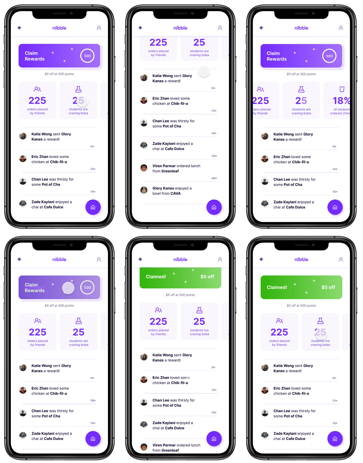
To introduce a social aspect to Nibble, we developed a spot where users can collect rewards and see where their friends have been ordering. This is especially important given we aimed to start service on college campuses.
On this page, the user can also find statistics on themselves and their friends which serves as a fun metric. Also, this is something a user would be inclined to share, increasing traffic.


what i learned
Nibble changed how I looked at interface design in many positive ways. Because developers were actively implementing my designs as I worked, I learned about real-life limitations which pushed me to only create realistic designs. I also found myself animating interactions in order to successfully communicate my vision with the developers. This grew my technical skill set and kept me grounded as a designer.
Working with a Project Manager taught me to look at the product from all angles and not just from a design perspective. I learned how outside factors can change the course of a product.
Working so closely with a passionate team was a rewarding experience.

Presenting our project to the judges panel also taught me how to better present my designs. Context for design decisions and prototypes allow the audience to engage with your product and understand your intention.

embedded Figma file
feel free zoom in 🔎 and check out my design :)